A trend is a form of change and change is inevitable. Social media graphic design is always full of trends, every year something new makes a trend while some stay for longer periods.
But over some time, everything tends to change. Let’s go in the past some years and see what was in trends. Some of them are no longer in trends yet some are still making a big hit.
2015
- Flat design
- Grid layouts
- Non-traditional fonts
- Ghosty designs
- Bright pastels
- Illustrations
- Single shade of solid color
2016
- Modern “Retro” style
- Material design
- Bright and bold colors
- Geometric shapes
- Modular or card-based layout
- Dramatic typography
- Custom illustrations
2017
- Bright and bold colors
- Color transitions
- Patterns and geometric shapes
- Minimalism
- Modern “Retro” style
- Bold photography
- Material design
- Hand-drawn graphics and icons
2018
- Gradients
- Animated and motion graphics
- Illustrations
- Minimalism
- Bold typography
- Cinemographs
- Layering up
2019
- 3D depth
- Anti-gravity flying elements
- Metallic effects
- Fluid and liquid effect
- Maxi typography
- Outline typography
- Open composition
- Gradients
- Asymmetry
Have you noticed the change in trends?
There are few trends which we saw earlier as shining stars now lost the shine. And few trends are gradually growing and taking larger space down the line like Minimalism or Bold typography. These are in social media graphic design trends from last 2,3 years and growing day by day as designs getting more sophisticated.
Now let’s see what are in trends in 2020 and will make shine in the coming years. We identified 7 trends that are followed by most of the graphic designers recently.
Apply these tips to help your brand stand miles ahead in the chaotic competition in social media graphic design.
- Heavy but simple fonts
- Minimalism
- Abstract illustrations
- Muted color palettes
- Color gradients
- Authentic stock images
- Flowing lines and shapes
1. Heavy but simple fonts
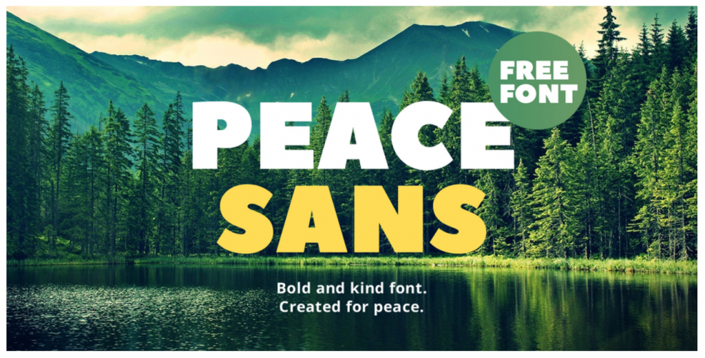
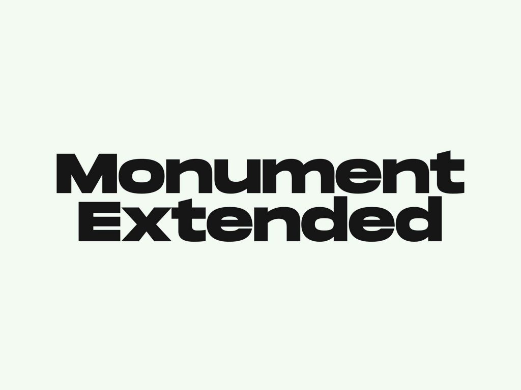
The typography trend is moving towards using heavy, bold, and simple fonts. These fonts are an eye-catching addition to simple graphics and will work for most brands.
Mix use of heavy and lightweight fonts is what will make your brand outstanding in 2020 and years to follow. Focus to use heavy fonts for highlights, titles, and important elements.
Let's see some examples of heavy fonts


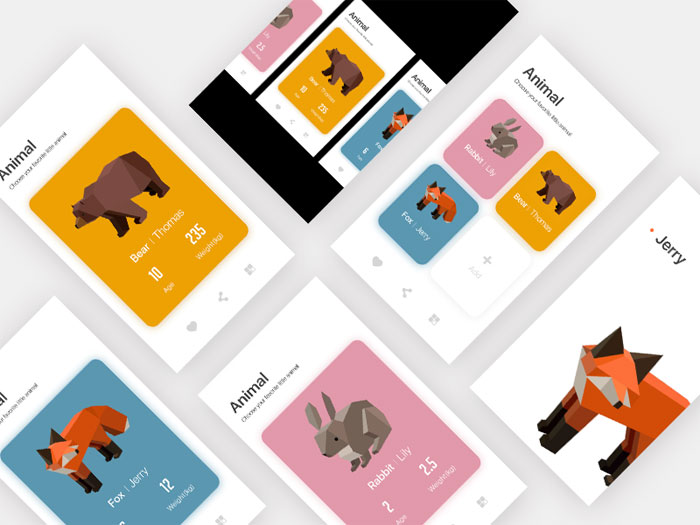
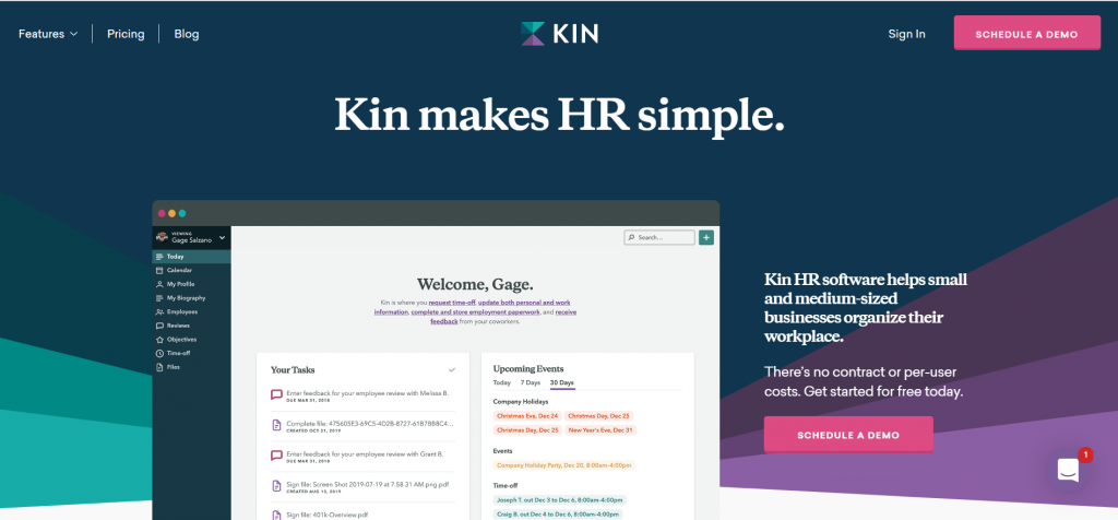
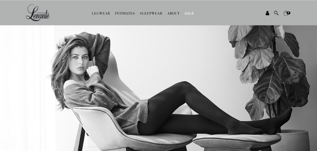
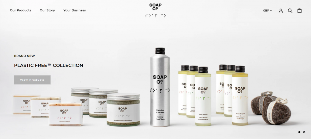
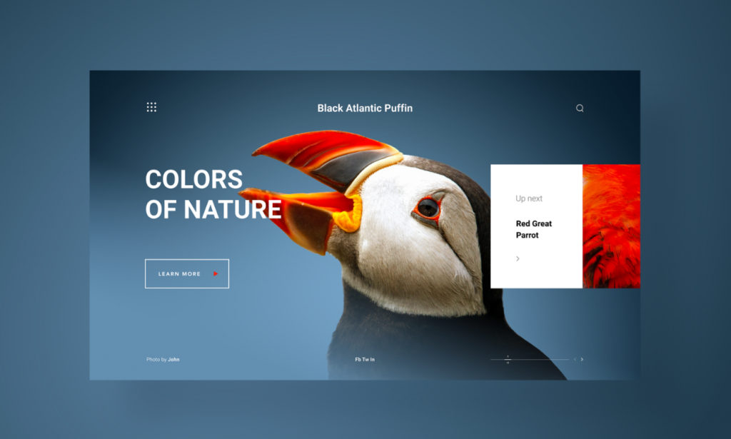
2. Minimalism
Minimalism is in the trends from the last few years. Now we are seeing more and more brands are creating their graphics around this concept. Earlier it was there in landing pages but now it shows in social media graphics as well.
Minimalism is in trend because it’s a clean, simple, and beautiful design framework. These designs are easy for users to understand and engage with. This trend is not going to last for a few more years.
Here are some examples of minimal designs


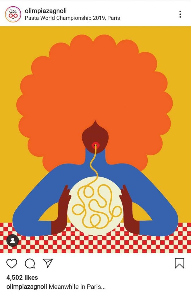
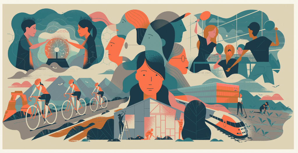
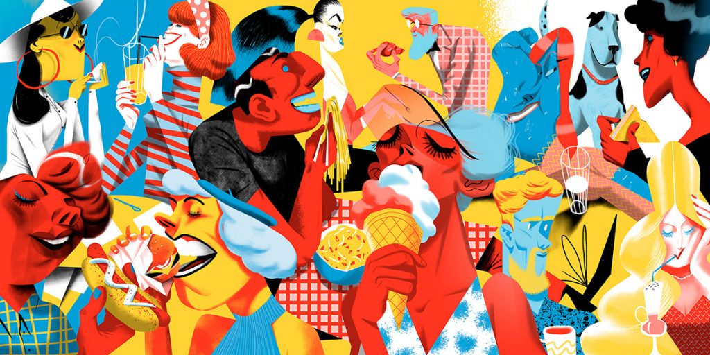
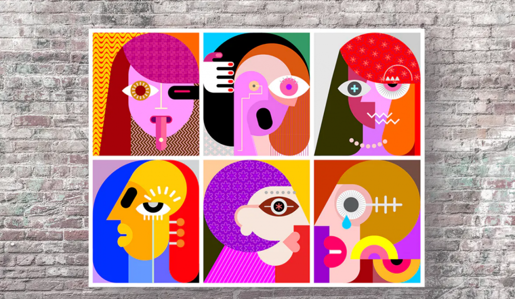
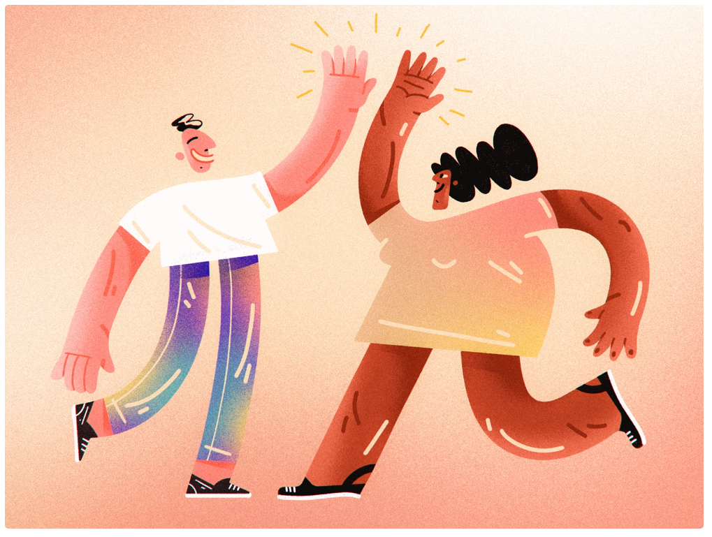
3. Abstract Illustrations
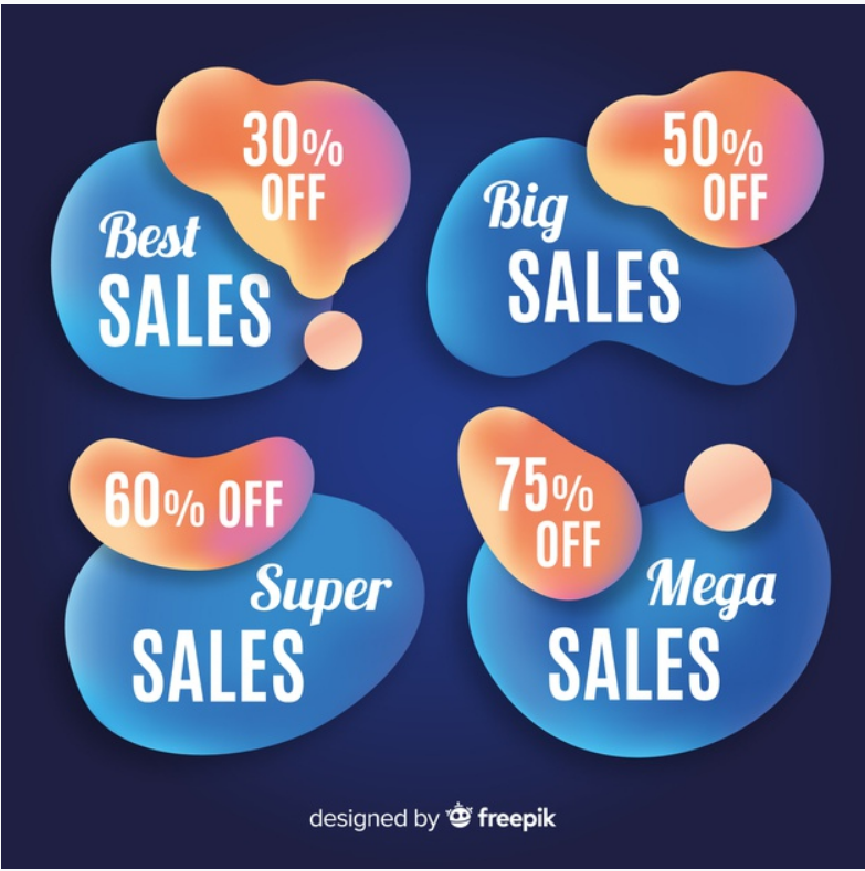
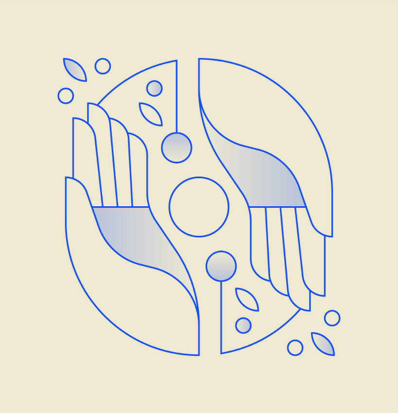
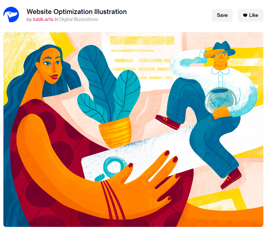
Illustrations are in trends from the last few years. In the early years, simple and realistic illustrations were in trend now the opposite abstract and dreamy illustrations are in trend.
This is also a growing trend which is exaggerating year by year. Now abstract, imaginary designs, unusual color combinations are taking the place of simple and realistic illustrations.
These are good to catch the attention of the viewer on social media and encourage them to spend more time on your posts.
That’s the reason why many brands start using abstract illustrations in social media graphics.
Here are some great examples of abstract illustrations:
4. Muted color palettes
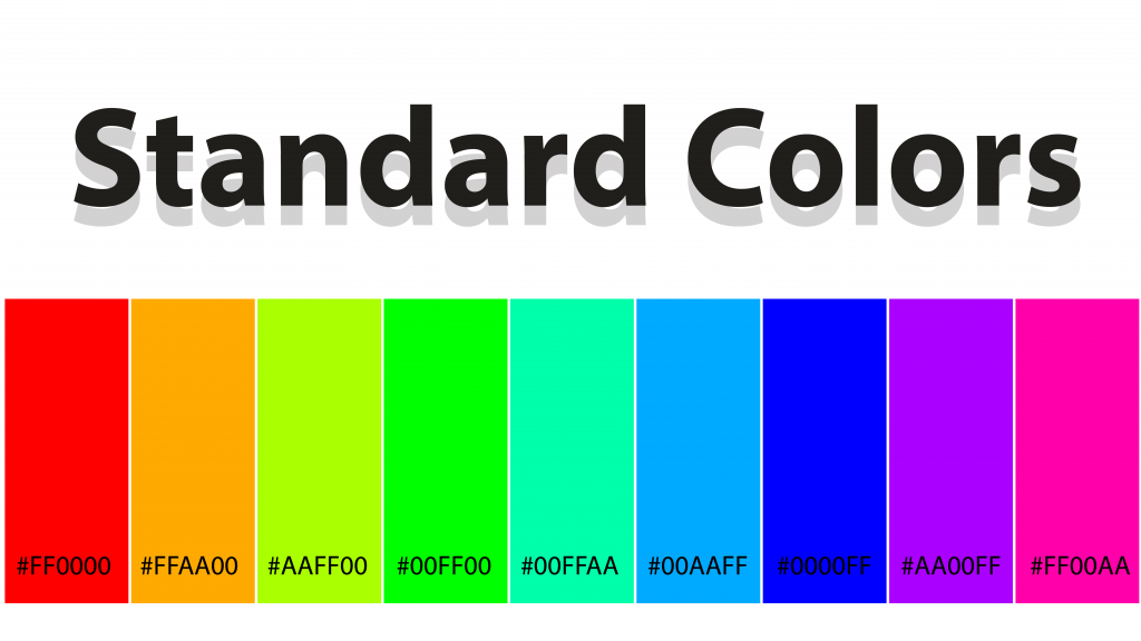
This is a new trend emerging in 2020. Earlier vibrant, bright, and bold colors were in trend. Now muted colors are taking the place of bright colors. A muted color has black or white added to it.
Muted color palettes are a great trend to easily refresh and update your graphics. With bright blues, electric yellows, and toxic greens appearing all over the yearly graphic design trends now taking place by more sedate ones, desaturated with complementary colors or a black and white template.
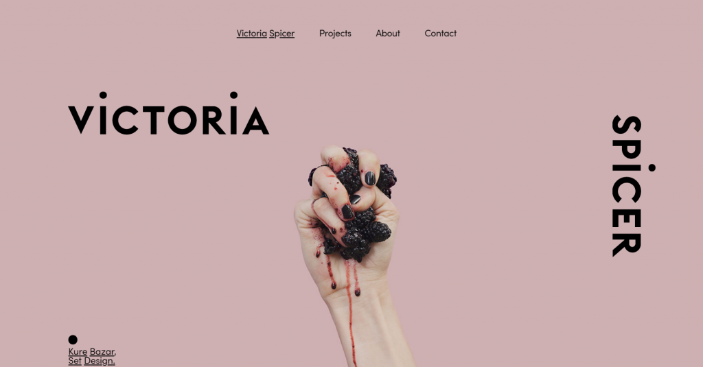
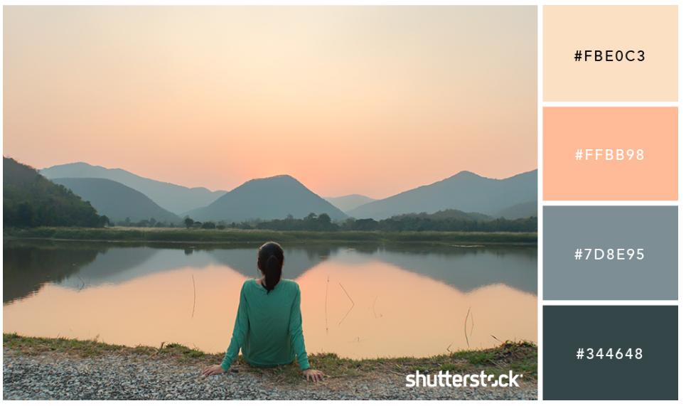
This can be an effective trend on social media especially as it can quickly be applied to your headers and images. The designs with muted color palettes look and feel much more natural and realistic than vibrant colors.
The graphic designs are getting more sophisticated and elegant. The use of bright and vibrant colors is getting minimal. In the future, we will see more sedate and desaturated colors in graphic designs.
Let's check what is the difference between standard and muted colors
Following are standard colors:
Following are muted colors:
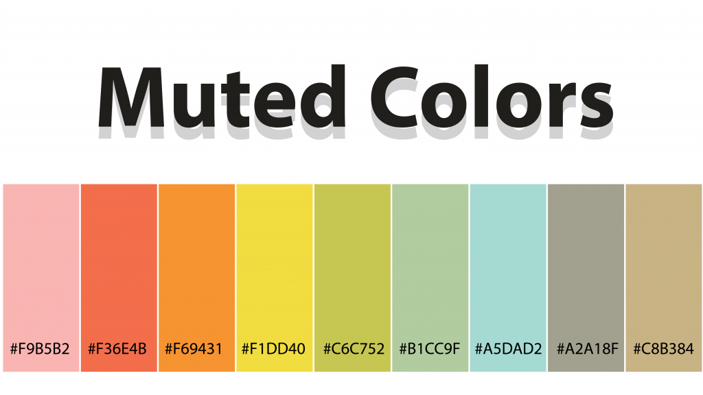
Now let's see some examples of muted colors implementation:


5. Color gradients
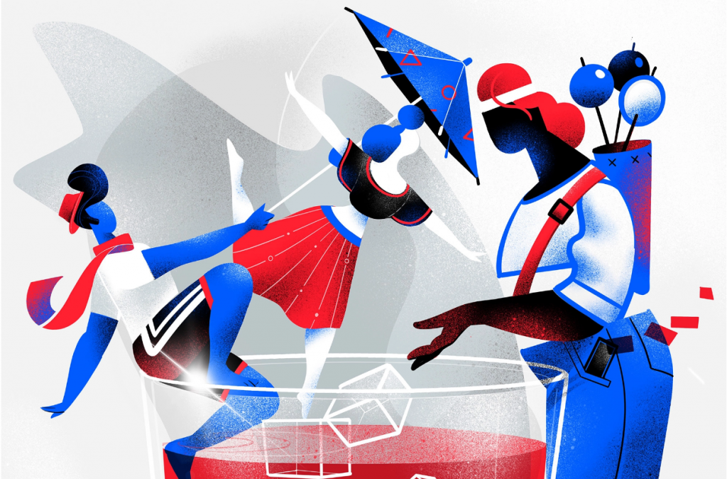
This is the third year in a row, gradients are a major trend in graphic design with more sophistication in the style.
Every year designers find new ways to use gradients in their designs. Earlier gradients were mainly used as eye-catching backgrounds. This year they are applying unique applications, through color filters, depth, and texture.
Instead of being the main focal point of designs, the gradients are just another element that elevates the graphic. Gradients can be used to add some depth to complex illustrations.
As brands continue to use these types of illustrations, gradients will replace the flat colors in an attempt to further differentiate themselves from other companies.
Additionally, with the rise of muted color palettes, gradients also are going to become a little less vivid and bright.



6. Authentic stock images
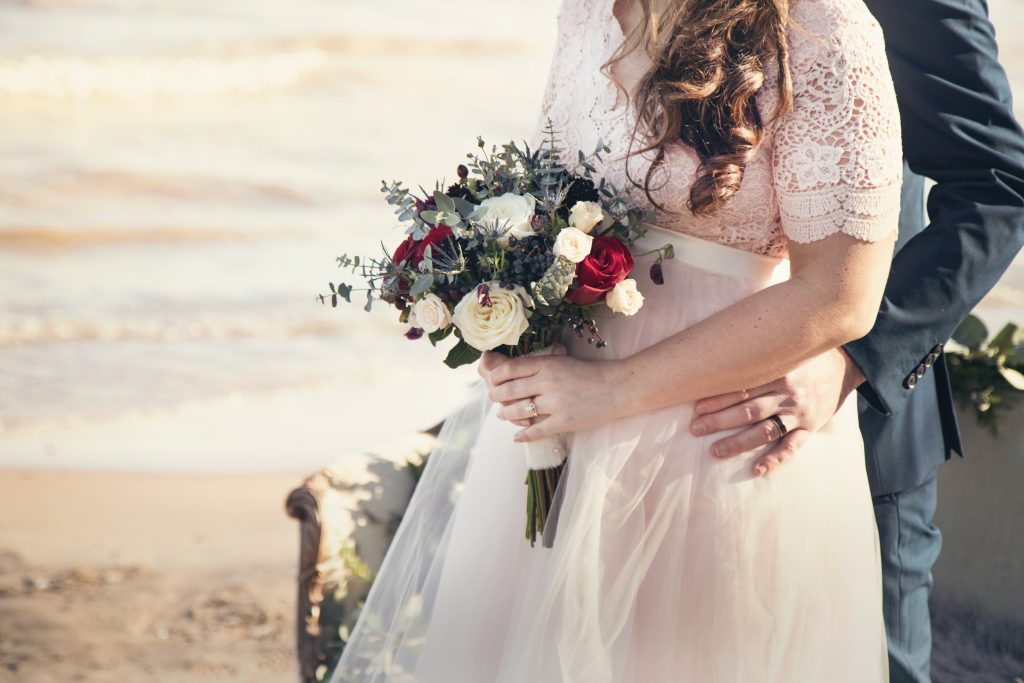
During our research, we found that designers are using stock images for many years. Earlier they boost colors and saturation in stock images which did not even look real.
As the overall social media graphic design trend is shifting towards muted colors, neutral lights, and realism, stock images are also used in the same manner. Now designers use stock images to look more authentic and real with natural colors.
This shift continues to push back against the overly edited, posed, and produced stock photos that some companies still use.
That means in 2020 and coming years, expect to see a lot more muted, genuine, and neutral stock photos being used.
There are many places to find high-quality stock images.
Unsplash, Pixel, Freepik
We also use authentic stock images in our designs at O! WOW Design.
We took some good stock images from Unsplash.com




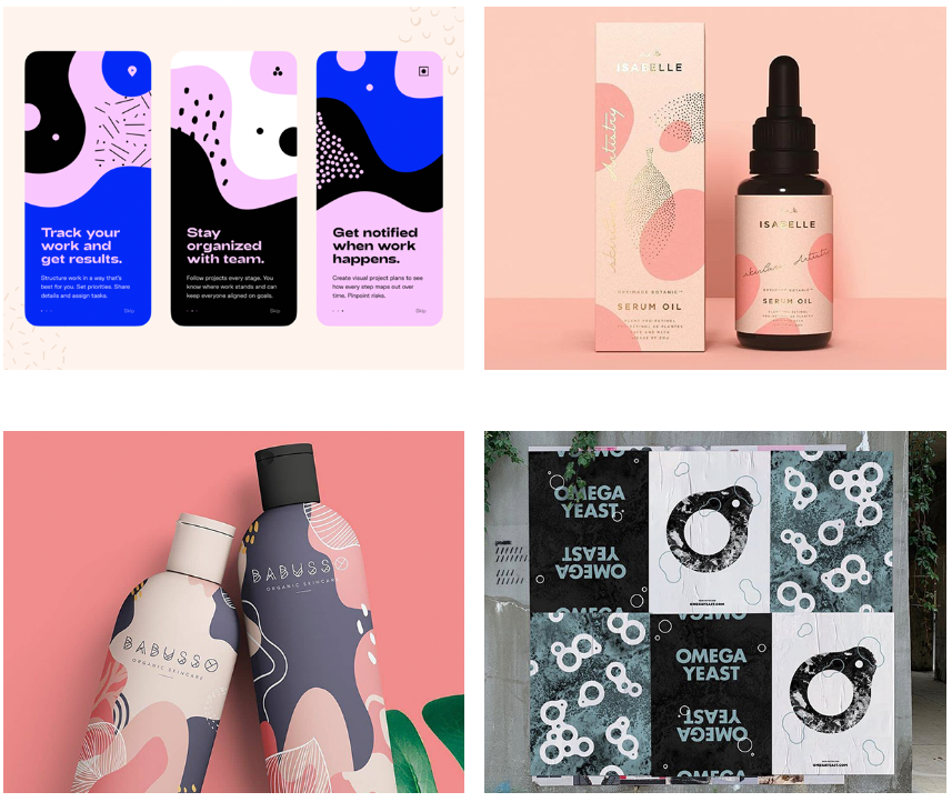
7. Flowing lines and shapes
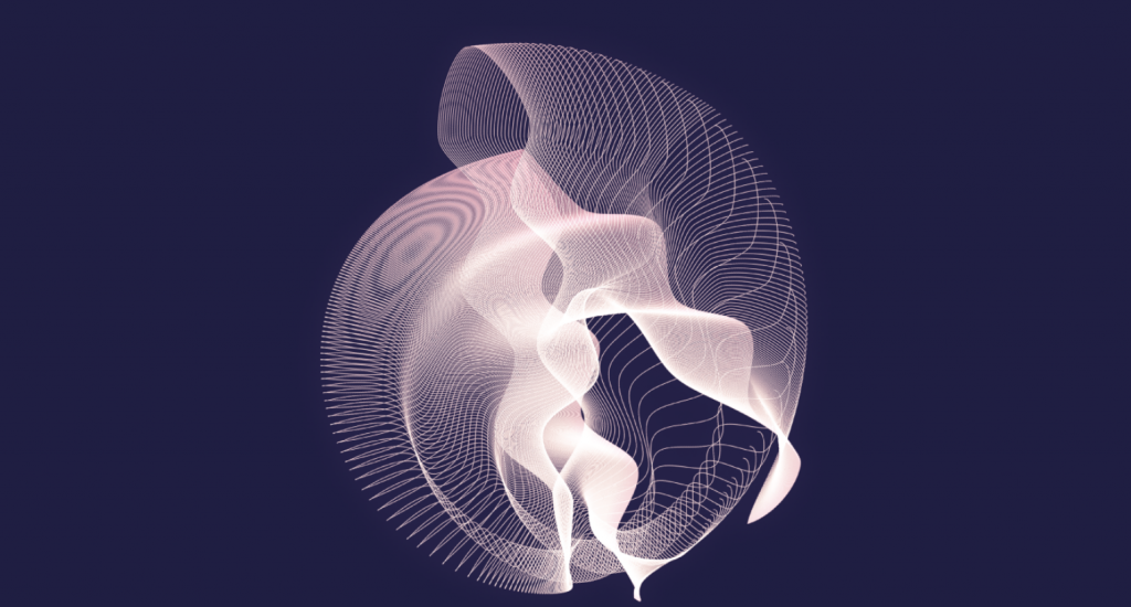
As we noted above, muted color palettes feel a lot more natural. Flowing lines and shapes are also used to convey the same feeling.
Flowing lines and shapes used with heavy fonts are going to be a new trend in the 2020 and coming years. These shapes give a natural, flowing effect to the overall design.
Earlier designers were using geometric shapes in their fixed and proper form which is now replaced by more flowing shapes, patterns, and lines. Especially because there are not many right angles or perfect shapes found in nature.
We believe this is a part of a shift in designs with abstract illustrations and muted color palettes that brands are embracing this year.

Bringing It All Together
We hope these trends will help you to decide your approach for content in 2020 and the coming years.
After studying thousands of shares and graphics we think that social media trends in 2020 will be all about realism, pushing creativity to the forefront and greater focus on genuine over generic.
Brands on social media are going to focus a lot more on muted colors, flowing illustrations, genuine stock photos in an attempt to keep their social properties distinctive from the others while delighting their followers in the process.
Are you looking to apply these trends to your designs? Pick one and start experimenting with it. Then slowly introduce the other trends to the mix, combine them in unique ways, and there you have it!
Hope you found it interesting. Please hit the share button below
You will like this too : Why good graphic design matters for your business
