5 Tried and True Web Design Best Practices
5 Tried and True Web Design Best Practices
There are countless pieces of advice on web design. Some good, some bad. And I’ve been through it all. From redesigning 100s of websites I’ve learned what works and what doesn’t. Often times I think people tell you certain things because that’s how they’ve always done it and don’t consider whether it was the best decision in the first place. This post focuses on five tried and true web design best practices that can help improve your site regardless of what type of content you produce.
1. Good design is simple
In terms of website design, less truly is more. Decluttering and simplifying your company’s website allows users to seamlessly get the information they need, and it also helps ensure that visitors see your messages and calls to action.
What is a simple design:
- Utilizes white space effectively
- Minimizes the number of colors and fonts used
- Does not overload images
- Uses a common page layout throughout the site
- Avoids too much content
- Uses short and concise copy
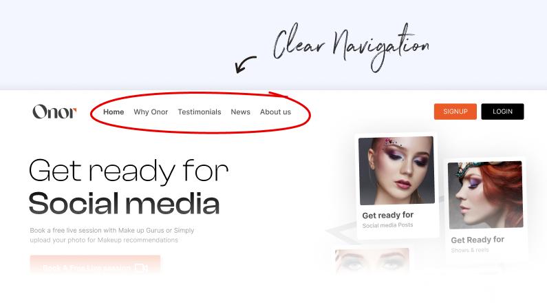
2. Clear, simple navigation
Your website should be as easy as possible for users to navigate. A great design will utilize main navigation that includes no more than seven items and also has sub-navigation on secondary website pages. To nail down the items that you should include in navigation, examine the pages most viewed by visitors who become customers. This can be achieved by using the Visitors Flow Report in Google Analytics. Once you know the pages you would like in your website’s navigation, determine the actual term to use in the navigation bar. The terms should be short (2-3 words), include words that your customers use, and also consider search engine optimization.
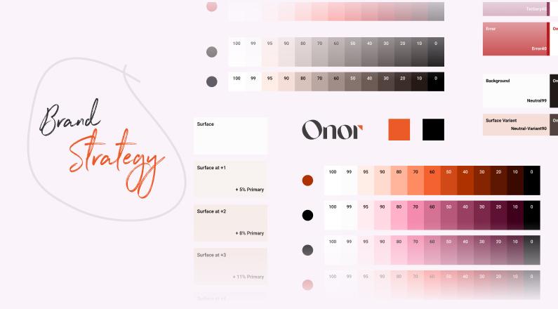
3. Always consider your brand strategy

Branding materials such as colors, fonts, and your logo are important to consider and finalize at the beginning of your website’s design. To ensure your branding assets will give your company the representation you desire, follow each of the tips below:
Colors: Colors can evoke emotions and determine how someone feels about your brand. Before you start designing, select some basic colors for the brand and website. Choose colors that are parallel to your products and services and also help support the message your brand is sharing.
For example, a green living company would want to use colors that remind visitors of nature, such as sky blue. You should also avoid colors that are similar to those used by competitors.
Fonts: Early in the design process, decide on font families and sizes you’ll want to use. Your website’s font should be easy to read; a unique, cool-looking font may not appeal to visitors if they cannot quickly read it. You should also stick to no more than three font variations: one each for the body text, headers, and sub-headers.
Logos: Your logo is your brand’s visual representation and is also essential in website design. If you have not yet developed a logo, start by discussing the story behind your company, then simply brainstorm and sketch ideas. From there, share these concepts with a designer. If you already use a company logo, be ready to forward its design files to your website development team.
Branding style guides: Let’s say your company has some branding intricacies that should be considered in website redesign (e.g., you avoid certain types of images or prefer a more professional tone). Compile this information into a brand style guide to share with the website development team.
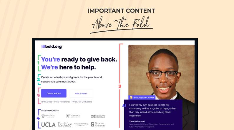
4. Place important content above the fold

When marketers refer to content being “above the fold” on a website page, they are referring to the content that displays without requiring the visitor to scroll. This is the content you first see when landing on a site page. Because many website visitors don’t take the time to scroll below the fold, place the content you value most or think will be most beneficial in driving lead and customer conversions above it.
5. Design with inbound in mind

Website design is not just about looking good; it should also help you achieve your inbound marketing goals, from effectively attracting visitors to converting leads to turning those leads into customers. When designing your website, keep in mind these important inbound marketing concepts:
Attract Visitors
A website with the latest and most aesthetically pleasing design can improve your brand and grow your sales funnel, but only if visitors end up on your site. There are several channels by which visitors find your website; the most important elements in attracting visitors when designing your website are outlined hereafter.
Search Engine Optimization (SEO)
With 61 percent of global Internet users researching products online, SEO is essential. In addition to optimizing your website using the suggestions already shared, follow these best practices:
Think about SEO from the start. Complete a website audit before starting redesign. Take into consideration important SEO elements, including:
- Number of pages that receive traffic
- Number of indexed pages
- Total of inbound linking domains
- Best-performing keywords
- Average monthly visitors and unique visitors
- Set up proper 301 redirects
- Clean up poor-quality backlinks
Blogging
Regardless of your company’s industry or market audience, blogging is a central component of attracting visitors to your website. It helps improve SEO because search engines will crawl your site more frequently with each new piece of content, which ultimately gives you more opportunities to attract leads and customers. Below are some tips for how best to design a blog for your website:
- Add your blog to the main navigation and/or link to it from your homepage to make it easy for website visitors to find.
- Your blog’s design should be an extension of your website design and incorporate similar design concepts.
- Add the capability to sort by categories or publishing dates for easy navigation.
- Include a form on the design template to subscribe to your blog to help grow subscriptions.
- Use consistent header fonts and sizes for each blog post you publish.
- Add room for calls to action to your content offers in the blog post’s design.
- Keep your blog updated and constantly work to publish fresh content.
Social Media
Along with SEO and blogging, your website can gain traffic from social media channels. When designing your website, utilize social media by incorporating some of these best practices:
- Add social icons that link to your social media accounts universally throughout the site (usually added to the footer).
- Add social sharing icons to landing pages, thank you pages, and blog posts. (Note: Social sharing icons differ from the social icons mentioned above in that they allow the user to take the content on the page and share a snippet with friends and followers.)
- Don’t overdo social icons. Choose to include only those that give you the most ROI and that you are able to manage.
- Include your website’s URL on your social media profiles to drive traffic.
Lead Generation
A website design will reap true ROI only if it has been effectively designed for generating leads. To ensure that your website helps you capture more leads, incorporate the following tips in
your designs:
Develop and optimize content offers. You likely already have several content offers such as e-books, checklists, worksheets, and white papers. With your new website design, follow these tips so that content offers help make that design even more effective:
- Update the design of offers to accommodate design changes in the website if required.
- Create offers that are valuable to your buyer personas and will help provide them the answers to some of their typical questions (e.g., “Is inbound marketing right for my company?”).
- Include offers on each website page and make sure the primary offer stands out.
- Utilize landing pages and forms to gate offers and capture lead information.
Landing Pages
The design of landing pages should not be neglected in your redesign plans. A landing page is essentially the gateway to your offers and the last touchpoint before visitors convert to leads. Get the most leads out of each offer you create, optimizing the landing pages’ design for these best practices:
- The layout should be simple.
- Copy should be clear, concise (bullets help with this), and tell readers what value they will get from downloading.
- Copy should also call the visitor to take action and clarify what should be done next.
- Remove navigation because it distracts visitors from converting.
- Add an image to highlight the offer.
- Limit the number of questions on the form. Too many questions can deter visitors from converting.
- Use custom copy (e.g., “Download e-book”) rather than the standard “Submit” for the form button.
- Optimize your landing page for search engines.
Clear Call to Action
Calls to action (CTAs) on your website are what drive visitors to your offers and landing pages. Typically, they are designed as buttons, but they can also appear in copy as hyperlinks. Below
are some tips for optimizing call-to-action buttons and how to effectively place them on your website:
- Use CTA copy that makes visitors want to act.
- Offer a clear value proposition.
- Link to a specific landing page.
- Target a specific buyer persona with your copy.
- Avoid industry jargon.
- Place a CTA button in areas with plenty of white space.
- Ensure each CTA button is large enough to stand out.
- Use spatial effects to make buttons look clickable.
- Place at least one CTA above the fold on a page.
- Use a CTA on every blog you publish.
- Test all of the above and make changes when needed.
Final Thoughts
Following these web design best practices while designing websites for our clients has helped us to increase conversion rates and to make designs look more professional and clean. I hope you find this list useful in your own projects. And as always, feel free to reach out with your queries.
Interesting Articles for You
- The Importance of UI and UX Design in Modern Website Development
- Why Design-on-Demand is the Answer to Your Creative Needs
- On-demand UI UX Design for Development Companies: Benefits and Features
- 9 Reasons Why On-Demand Design Services are Game-Changer
- All you need to know about social media graphic design trends in 2023


