Are you looking for
More traffic
More leads
More sales
This guide will help you to update your website.
Let's get started.
Chapter 1
What is wrong with your website
Your Approach
Often interior designers and architects take their websites as digital brochures. There is no harm in this approach if you are not looking for leads via the internet.
But websites are like your 24/7 sales team. It should be fully equipped to generate leads for your business.
Same Predictable Patterns
The majority of interior designers’ and architects’ websites have predictable patterns. Most of them are using readymade themes that offer the same look and feel for every website.
Only the serious designers have custom websites and it makes them stand out from the crowd.
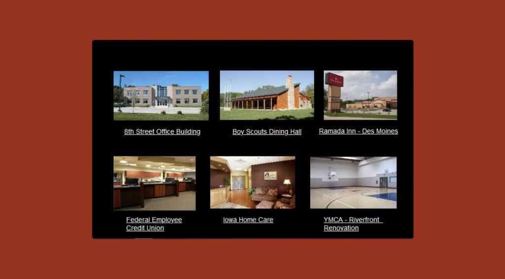
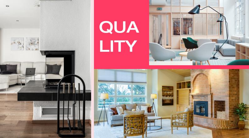
Choosing Quantity over Quality
The main problem with quantity is, it confuses the visitors and they overlook the best work of you. Rather than you should display only a few high-quality projects on which you are proud.
And clients never choose an interior or architect solely because of how many projects they have in their portfolio. They select based on the quality of work and the designer's perspective.
No Clear Message
On the majority of interior and architect websites, I found that there is no clear message on the homepage about the specific services they provide and it leads to a high bounce rate on the website.
It seems these websites are designed by interiors and architects for the design community.
Rather than it should focus on clients' requirements and how you can solve them.
Confusing Site Navigation
When you try to be different from other websites, you often use different terminology in your navigation menu.
This creates confusion for visitors and forces them to decipher where the information they are looking for is located on your website.
Keep it simple.
Broken Links
Broken links are the links that don't have any page linked with them and lead visitors to nowhere. Due to the use of themes, many websites have such broken links.
A simple example is social media or terms & conditions pages, often they are not linked with proper pages.
Broken links hamper your searchability on Google.
Hidden or Missing Contact Information
Often interiors and architects complain about never getting contacted through their website.
I am not surprised, many of them do not include their email and contact number on websites and a person rarely fills a contact form on site.
You should make it easier for visitors to contact you.
Key learning
- A website that does not help you produce leads is a waste of time and money.
- If your website is not providing leads it is because the site was likely not created with that purpose in mind.
Chapter 2
What prospects are looking for
Prospects can have problems or requirements which they want to overcome and they are searching for a solution provider who can help them. And you have only 7 to 10 seconds to grab prospects' attention by offering answers to these three questions.
What do you do?
First of all, prospects want to make sure that they are in the right place.
They also want to confirm that your services match the services they are seeking.
The home page is the best place to communicate what you do best and the type of work you want to be hired for.
For example, if you are specialized in creating high-end, modern, and unique coastal homes and want to be hired for them then the first fold of your home page should tell visitors very clearly that you provide “Architecture and Interiors Services for Coastal Lifestyle.”
Make sure that visitors to your site clearly understand what you do.
Clarity is KING!
Why should they care?
Prospects want to know why they select you over another interior designer or architect.
They want to understand what makes your firm different, unique, or interesting?
In the response to this question, you should communicate and share your firm’s expertise and experience relevant to your prospects and projects. The easiest way to grab attention is to communicate how you help them.
Again your homepage is the best place to explain the value you can add to your prospects’ projects.
Paint a picture of what your prospects will get when they select to work with your firm.
What do they need to do next?
It’s human psychology to follow written directions when using unfamiliar things.
And your website visitors are mostly first time coming on your website, they tend to seek direction on what to do next.
It’s your job to make it easy for visitors to take the first step and tell people what to do next to get started with you.
I am sure, your website has a “Contact Us” page with a contact form but you need to add the call to action on other pages to direct visitors to “Contact Us” to fill that form.
Even better you can use any appointment booking app to book appointments with you. I recommend Calendly for it.
Make sure you have added your contact information in the footer of your website too. This is the first place any visitor will check when searching for your contact number.
Key learnings
- Make it easy for prospects to engage with you.
- Your website is all about helping your prospects to see what’s in it for them.
Chapter 3
Things to consider before designing your website
To make your website a success, you should consider many things before you start designing your website.
A good web design agency will also help you to decide many things beforehand.
First, know yourself
If you are starting a new business you need to develop your brand identity first. Existing firms should also focus on branding before redesigning their websites.
Your brand identity sets you apart to be unique as a designer and as a business. If you find it difficult to do it yourself, I suggest hiring branding consultants.
Your philosophy, your vision should reflect through photographs of your work, and the About Us page is the best place to elaborate on your vision and philosophy.

Define your goals
Building a successful website starts with defining your goals. Whether you are starting from scratch, refreshing your website, or rebranding, it’s recommended that you understand your goals.
There are four main goals that you can achieve from your website:
- To get leads
This is the biggest reason to have your website. And it is the hardest goal to achieve.
To achieve this goal you must have a polished strategy from A to Z. This includes a well-designed site, with great content, providing a solid user experience, and, most importantly, it should pass Google’s criteria to refer to the site in search results.
To pass Google’s criteria and to be a winner you have to build a high user experience on the website along with all of the SEO and content marketing.
- To showcase designs to referrals
This requires a portfolio of your work. Being an interior designer or architect your portfolio plays a vital role in winning new clients.
Add high-quality professional images of your portfolio, have smooth navigation.
Refrain from the old portfolio and small low-quality images.
- To maintain public visibility
This can be a goal for very renowned interior designers and architects to maintain their public visibility.
These designers are not dependent on websites for business but still need a high-quality website to showcase their work and profile.
- To make it easy to find/communicate with them.
This is the simplest goal to achieve.
Many interior designers and architects just keep the website on one page and display their contact information with few images and titles.
The purpose of this kind of website is to provide contact details to people who are searching for these designers by their name.
Review your competitors’ websites
Before you start designing your website, take a look at the websites of your competitors.
This is to give an idea of what you like and don’t like and how you can make your website stand out from the crowd.
With research on other websites, you can identify your style that is aligned with your vision.
Define your requirements
There is no need to add a lot of flashy features. You just need a nice clean space that will allow your work to speak for itself, and an easy way for clients to be able to contact you.
Especially, as an interior designer or architect, you need a few things on your website:
Portfolio showcase - with high-quality images of selected projects
About - To express yourself as a designer
Services - To explain the kind of services you offer along with the price range
Contact information - For visitors to contact you
Key learnings
- People only spend three minutes on an interior design website on a desktop and only one minute on a mobile phone.
- Don't show too much work or too much text, because it distracts people from staying focused and giving you their contact information.
Chapter 4
Why do you need a great website for your firm
There are thousands of interior designers and architects in the market. To differentiate yourself from other players and communicate your value proposition, a website is the best medium.
Let’s check the details.
To meet expectations of future clients
The expectations of your potential clients from your website are kept on changing.
10 to 15 years back, they were only expecting your website to have contact details and a digital brochure of your work.
But now expectations have evolved. Your visitors have different expectations from your website in 2021 and the years to come.
They want more than pretty pictures. They are looking for specific information, answers to important questions.
If your website makes this information difficult or impossible to find, then you’ve lost them.
Make sure your website helps them to better understand what you do, what makes you different, and why they should work with you.
To automate your lead generation
Your goal should be to automate your lead generation process and your website is the best tool for it.
Provide all the information your potential clients are looking for and direct them to take proper action on the website.
You can do it by adding appropriate call-to-action buttons like ‘Schedule A Meeting’ or ‘Book A Demo’ to your website and lead prospects to take action.
You can drive traffic to your website through search engines, social media, and other marketing channels which ultimately help you in lead generation.
To improve searchability
This is the 21st century and people search online for anything they are looking for. Your website, and your ability to be found online, are crucial to your firm’s survival.
You need a great online presence to get people to consider hiring your firm over all the other ones out there to satisfy their architectural needs.
Make sure you added your local listing to search engines, like Google, Yelp, Yahoo, and Bing, so you appear in local search results too.
Search engine optimization for architects and interior designers is a major blind spot.
Optimizing your website for search engines is very crucial to improve your ability to get found when someone searches for an interior designer or architect in your area or any specific keywords.
Your web design should make it easy for search engines to index your pages and figure out what they mean.
To showcase your best work
Your website is like a mirror of your work. If your website is terrible, people will likely transfer that impression over to your design work.
So you need a great website to showcase your best work.
Your portfolio is the number one thing that any potential client would like to see from an interior designer or architect.
You should add only high-quality images and videos in your portfolio of the best projects.
Show only a limited number of projects in your portfolio that are the best in your eyes.
Having random images creates confusion in visitors and chances they won’t contact you.
If you have worked with famous people or brands, prioritize to showcase their work in your portfolio.
If your work got featured in any magazine or got recognition, displaying it on your portfolio adds a lot of credibility and trust in your work.
Architecture design projects are exceptionally visual.
Let your visitors see what you spend your career building with more than one picture of every project.
Put time into your portfolio.
Give every project detailed descriptions and weave the story of how the project came into existence.
More imagery and content in a clear URL structure will make a difference.
Key learnings
Your website is now the first place most buyers will go to learn about your firm, even if they are referred to you.
Also when it comes down to choosing an interior designer to work with, more than 60% of users tend to trust the ones with a website. So having a website helps you in beating the competition.
Chapter 5
How to create a great website for your firm
I have already explained the importance of a great website for interior designers and architects.
Now let’s check how you can create a great website.
Hire a good web design agency
By hiring a good web design agency your half work is done.
A good team will not only create an awesome website for you but guide you on every aspect of website design and help you to make the right decisions.
A good web designer understands and appreciates your point of view.
Once you have a genuine connection with your designer, it makes it easy and enjoyable to design an awesome website.
Invest in a professional photography
The look and feel of your website depend on the quality of your images.
Being an interior designer or architect, visitors are expecting high-quality imagery on your website.
Invest in a professional photographer. To get these authentic high-quality images of your projects.
Publish regularly
Recent = Relevant
Many interior designers and architects are very busy and won’t update their websites regularly. It gives a wrong impression to visitors. They might think you don’t work anymore. I believe you don’t want to impose this image on your website.
Publish your projects regularly, it helps in two ways.
- Your visitors will see your latest work every time they visit your website.
- Google will rank your website higher as it is updating regularly.

Be human
The visitors on your website are human and as a human, we like to interact with other persons. For example, we like to read books where the author wrote them in the first person. Writing in the first person makes it interesting to read.
Your website is no different, you should also narrate your stories in the first person to make them interesting for your visitors.
This will make it easier for potential customers to relate to and build stronger relationships with your firm, leading to higher conversion rates for new customers.
Show your expertise
When it comes to hiring a professional interior designer or architect, prospects will select a professional who is an expert.
So on your website, you should show your expertise rather than copy and paste content from other websites.
Show people what they can learn from your experience or teach them something useful.
Don’t just show images of your work, prospects are more interested to know your process. Explain in detail your process so prospects can understand.
This information shows that you know what you’re doing, and helps establish trust early on.
Keep It Clean
It’s of no use to bombard visitors with a lot of information. You have only 8-10 seconds to impress visitors to stay on your site. If you fail to do so, they will vanish away.
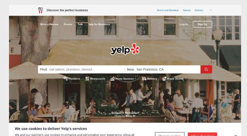
Keep your website simple and clean to make it easy for visitors to navigate through all the information.
Too much clutter distracts visitors from your work and prevents them from being able to focus on any one thing long enough to get useful information.
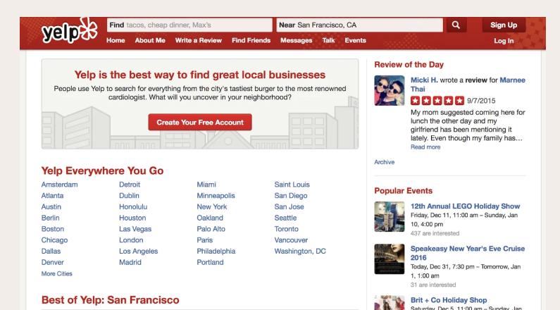
Clumsy website Example
Clean website example
Key learnings
- Instead of focusing your homepage on photos, put your areas of expertise front and center, so you can guide clients to information that’s most relevant to them.
Chapter 6
Structure of a great website
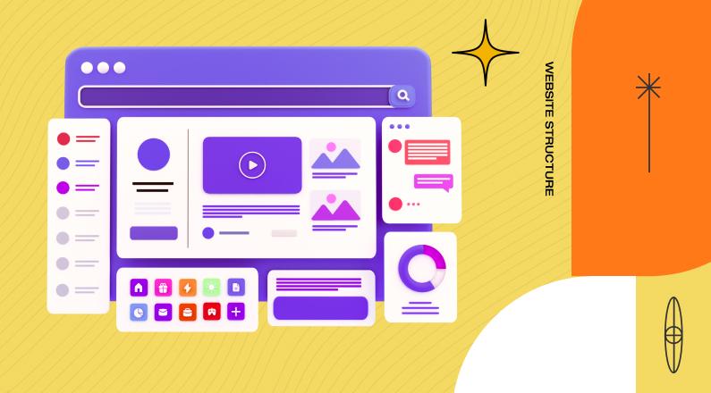
Now it’s time to discuss the structure of an ideal website for interior designers and architects.
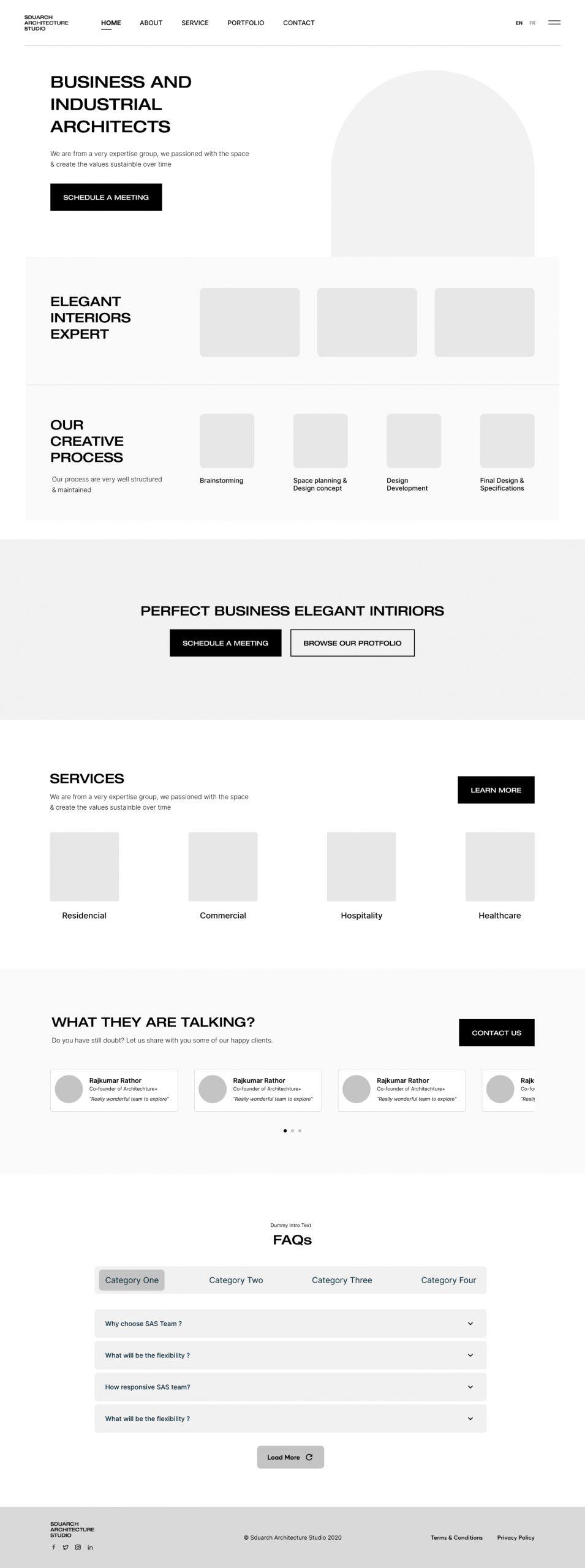
Home Page
The most important page on any website is the home page. As per Google Analytics data, almost 80% of visitors land on this page or if they land on any other page, they will check the home page before closing it.
Let’s check what makes the home page intuitive.
Headline
Tell your visitors what’s in it for them. This helps your visitor know they have come to the right place.
Some examples of headings:
“Architecture Services”
“Elegant Resident Architecture”
“Business and Industrial Architects”
“Interior Design for Luxury Apartments”
“Infrastructure and Civic Designs”
Hero Image
One high-quality image of your best project. This image will speak more than 1000 words for you so make sure you have the best shot.
This image will tell the quality of work you do, the kind of work you do, the type of projects you are capable of doing.
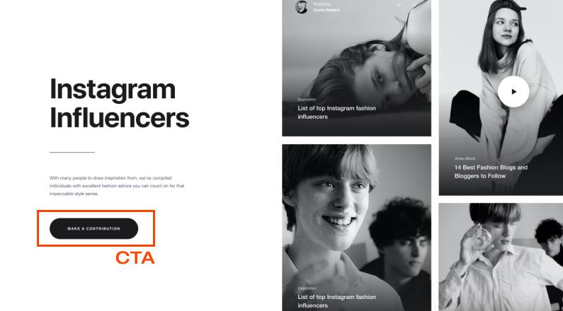
Call to Action
I suggest keeping a limited number of calls to action on websites. Ideally, it should be two.
The call to action will guide visitors on what they should do next on your website.
I found many interior designers’ and architects' websites without any call to action. They are expecting visitors to go on the contact page and fill out the form but it never going to happen until you guide them through.
Some examples of call to action:
- Book A Demo
- Schedule A Meeting
- Download eBook
- Start Your Free Trial Now
Services Section
Prospects have specific requirements and are searching for experts who can help them.
In your services section, you will help them to understand what kind of services they can expect from you.
In other words, you are explaining what kind of projects you are looking for and what kind of projects you do.
Some examples of services:
- Residential
- Commercial
- Hospitality
- Healthcare
- Academic
- Landscape
- Remodifications for Renovations
- Civic or Infrastructure
- Artistic installations
If you are specialized in something, highlight it. This builds trust in prospects.
Some examples of specialization:
- Green or low environmental impact
- High end or luxury residential
- Cabins
- Small or mobile structures
- 3D printed technology
- Elegant interiors
- Innovative classroom designs
- Interior for living spaces
Process
Your design process sets a road map to realize your vision for projects.
It is a planned, organized, and coordinated documentation of all design elements, selections, and decisions made along the way.
It shows your work style and what clients can expect from you.
After analyzing 200+ websites I found that almost 70% of websites don’t define any process at all and leave visitors to guess their work style.
An example of a process for an interior designer:
Brainstorming
Space planning & Design concept
Design Development
Final Design & Specifications
Construction & Installation
An example of a process for architects:
Pre-Design
Schematic Design
Design Development
Construction Drawings
Construction
Client testimonials
Do you have happy clients? Why not ask them to share their testimonials with you.
Authentic client testimonials build trust in you and your services.
Awards & recognitions
If your work is recognized, please showcase it on the homepage of your website.
This will also help in building trust in prospects.
FAQs
Frequently asked questions are the questions you faced daily in client meetings.
Providing answers to these questions upfront elevates many doubts and educates prospects.
This can be a list of 4 to 5 top questions.
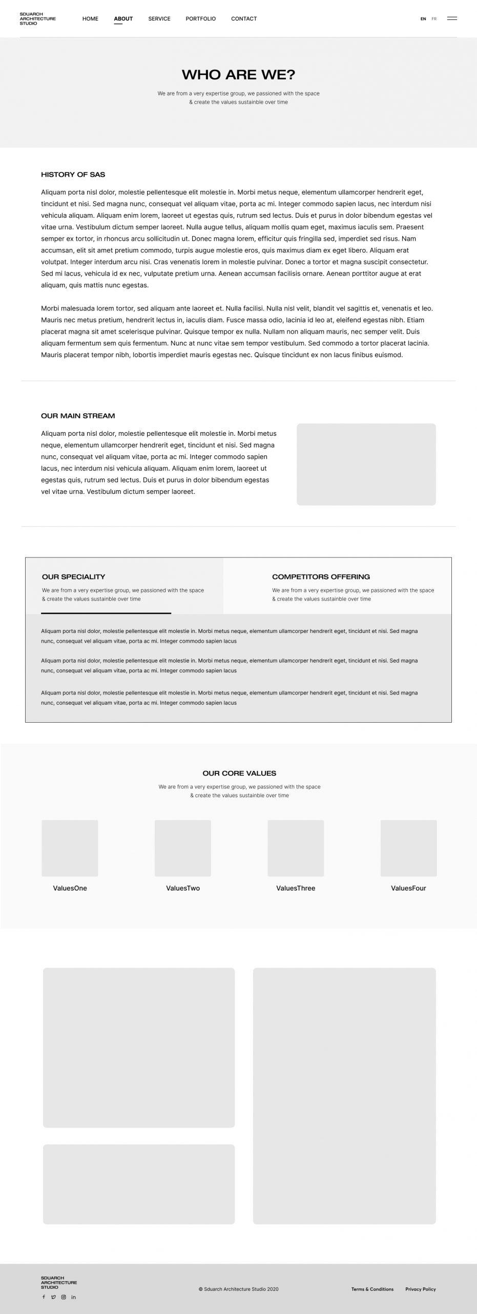
About Us Page
This is the one place you should use to brag about yourself. This is your opportunity to tell the world why your company is awesome.
The prospects who visit the about us page are keen to know more about you. They’re trying to determine if they can trust you.
They are looking for answers to questions like these:
Is this a big company or a small one?
How long have you been in business?
Where are you based?
What makes your company special?
What are your core values?
Why should they buy from you instead of your competitor?
This page builds trust and authority.
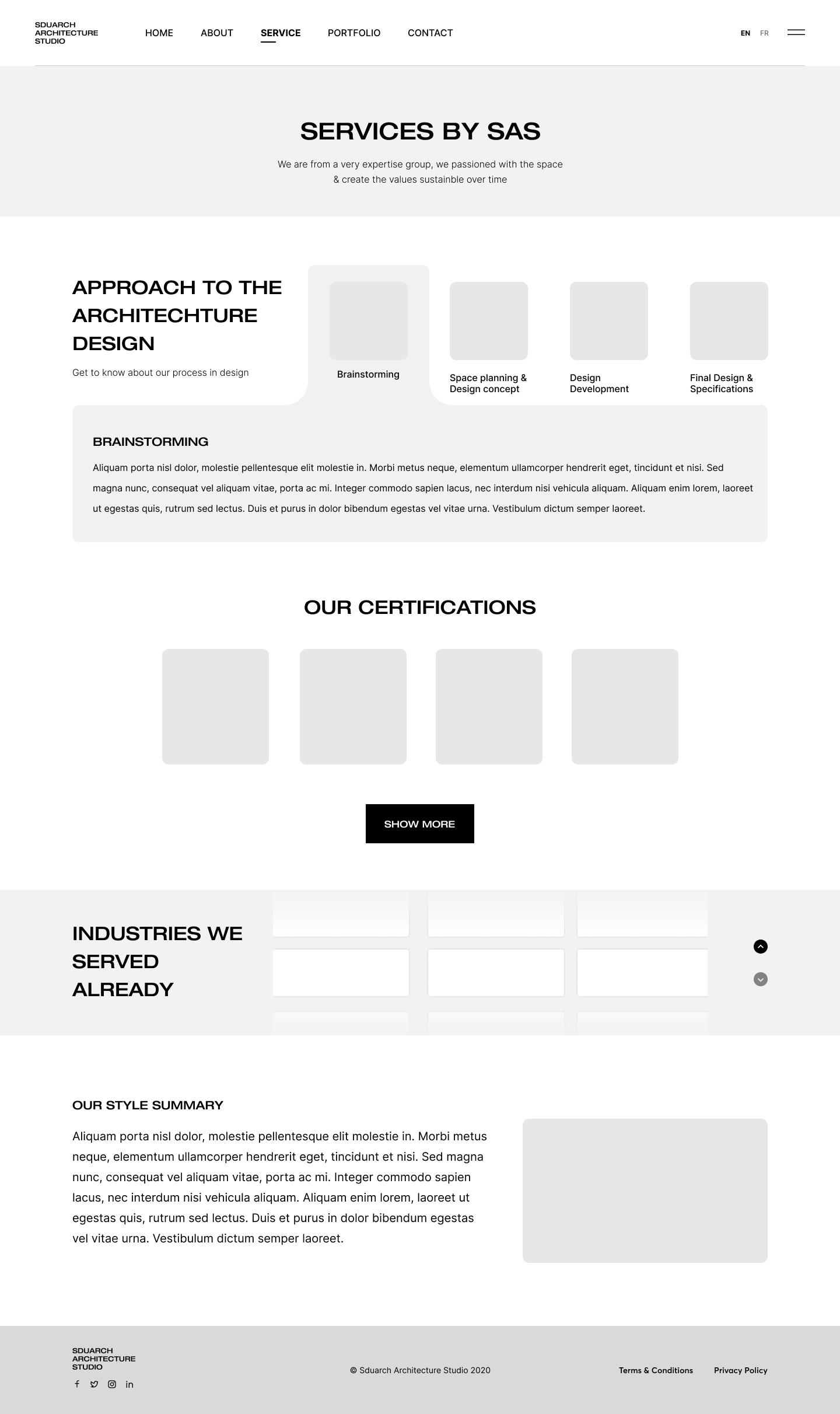
Services Page
This is the detailed page for the services you provide and the specialties you have.
You should elaborate on each industry you serve and the kind of projects you do.
Some elements you can include:
- Approach to the architecture or interior design
- All the industries you serve
- Service offerings
- Certifications
- Specialties
A general summary of your style
Portfolio
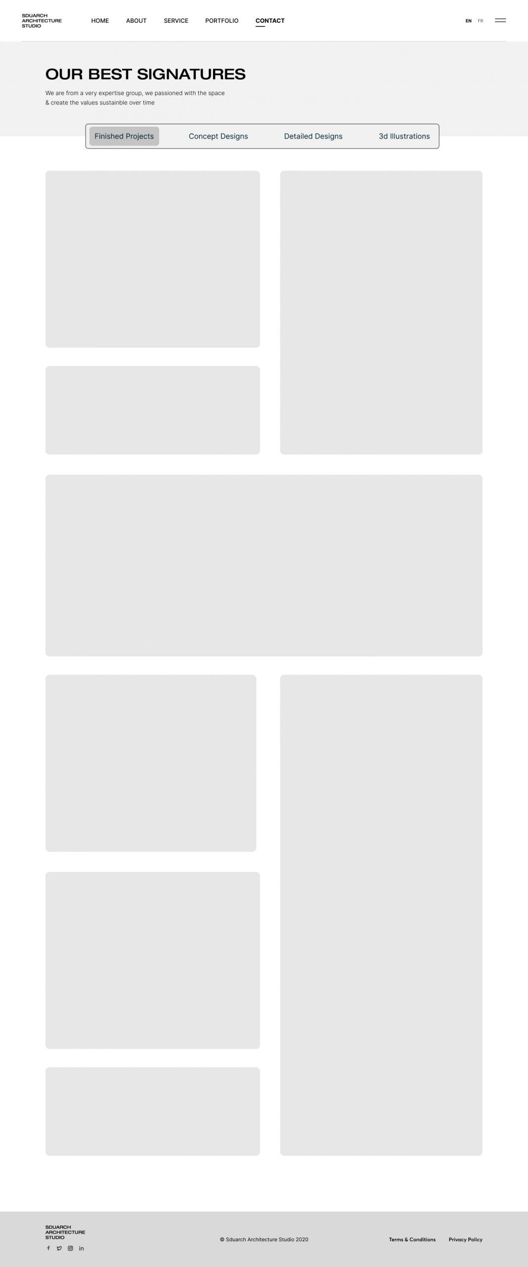
This is the place where you will win the clients. Make it visually appealing that your prospects can’t resist contacting you.
You don’t need to show all of your work. Select the best and most recent work you completed and showcase them nicely. Create a story around it, specify the important elements of the projects such as the project scope, the challenges, the client brief, and your solution in a clear, coherent manner.
Elaborate on how you approached the projects you have worked on. Emphasize your design philosophy, management process, and execution of the project.
Showcase high-quality images, illustrations, videos with 3D visualization, plans, and original sketches to spark the interest of the visitors.
Portfolio examples:
- Finished projects
- Competitions
- Concept Designs
- Detailed Designs
- Drawings & sketches
- 3D illustrations
Contact Us
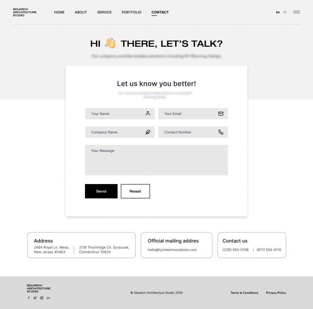
It is one of the main pages on your site. People visit the contact us page when they want to get in touch with you or want to know about your physical address.
Your contact us page should have the following options:
An explanation of why visitors should contact you and how you can help to solve their problems.
An email address.
A physical address. You can add a map for directions.
A contact form. Keep fields minimum so visitors don’t hesitate to fill in.
A telephone number.
A call-to-action to keep people on your website and provide them with another option if they don’t want to complete even a simple form.
Links to your active social media accounts.
It’s also helpful to your visitors if you set some expectations and let them know how long they’ll typically have to wait for a response.
Key learnings
- A great design that shows off your work is a given, but your website needs to appeal to your ideal client, and it has to provide a solution to their problem.
- Your website is your business card. You don't want to hand out an old, tired card. You want your card to be shiny and in top condition.
Chapter 7
Best practices of a great website

After discussing the structure of the website, it’s important to check the best practices you can apply to your website design.
By following best practices you will ensure a seamless user experience and increase the odds of converting them into satisfied clients in the future.
Let’s dive deeper into the best practices of a great website design:
Create a design that fits your business
The design of your website has a huge impact on how visitors perceive your business and the quality of your services.
Just like the design you create for a building with a sense of harmony and consistency, your website design must follow suit.
Your website’s design should reflect your brand. Develop a brand guideline for your firm first if you don’t have one. Keep things simple, avoid using fancy typography and color combinations.
Best to create your style rather than copying someone else.
Take help from professional web designers to design your website, tell them your aspiration and idea for the website, and let them design it for you. It will save a lot of time and energy and you will get a professional website.
Simple navigation
Your website’s navigation structure has a great impact on conversions, and bounce rates.
If your visitors can’t find what they are looking for, they will leave and that’s not good for your business.
Create simple and easy navigation for your website.
Keep your menus on top and make the header sticky so users can access it while they scroll on pages.
Use the common words to describe the pages on the website Like, Home, About Us, Our Services, Portfolio, Contact Us. If you use some fancy words instead of these you will confuse visitors and they would find it difficult to navigate.
You can also add helpful links to your footer. When people scroll to the bottom of a page, they should be able to consider browsing. This prevents them from having to scroll up and down to find information.
Your navigation plays a crucial part in keeping users on your site and can help users find the information they want and stay engaged with your content.
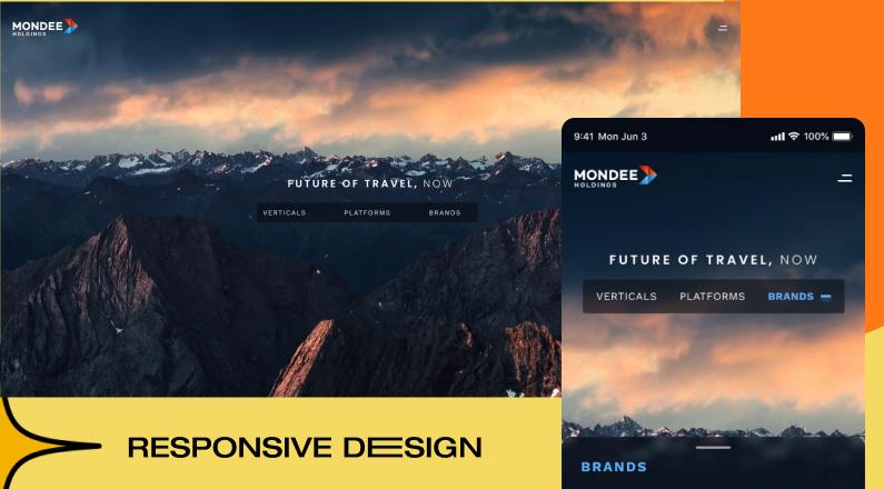
Responsive design
We have surpassed the era of desktop browsing. Now people access everything on mobile and leave the sites that are not responsive or looking great on mobile devices.
Google also considers mobile-optimized design as a key search engine ranking factor.
By making your site accessible to users with a variety of screen sizes and operating systems, you open your business up to a wider audience. You also ensure that your site always looks good, which will make a good impression on potential clients.
If you hire a good web design agency, they will take care of it for you.
An increasing number of Internet users visit sites on devices other than computers, and it’s important to design your site with that in mind. The best way to accommodate all visitors is responsive design, which ensures that your site displays and functions well across all devices.
Prioritize speed
Any site which takes more than 3 seconds to load, has lost more than 50% of visitors. And this is a huge loss of opportunities.
Being a website for interior designers and architects, it must have high-quality images to show off your portfolio of projects but big images take time to load, and that means lost visitors.
There are solutions available for it too. Resizing your images is the easiest way to ensure higher website speed. We recommend keeping files to 1500 pixels or less on the longest edge. We also recommend having image file sizes at 200 KB or less. There are various tools available for image resizing.
You should know about it but no need to worry if you hire a good web design agency. It is the web agency’s job to organize them in such a way that their loading time does not bore the potential clients.

Content is always king
In my research on interior design and architecture websites, I found more than 70% of websites don’t have much content on their websites.
They consider project portfolios as the best and only way to communicate their expertise.
But this is not the case.
Along with a good portfolio, prospects are looking for many other hot questions like, 'how do you work,' 'what's the timeframe,' 'what's the cost,' etc.
The more you can answer the concerns of your prospects the more time they will spend on your site, and the more likely they are to contact you.
By answering these questions on your website, you will solve several problems at once:
1) You'll help them to confirm that they have come to the right place.
2) You'll save time having to answer the same questions over and over.
3) You'll attract more search engine traffic because these are the same questions that clients typically try to research when they go looking for answers on Google.
You can create content in many forms like blog articles, FAQs, podcasts, videos, infographics, and many other ways. Choose the format that works best for you.
Optimized for search engine
You have designed a great website, launched it, and are ready to welcome visitors. But you are still not getting the crowd you were expecting. Why?
Because no one finds your new website when they are searching for solutions to their problems.
So how to make your website visible when someone is looking for interior design or architect services on Google or other search engines.
Here comes the SEO (search engine optimization) in the picture and it has become such an important topic for site owners for over 20 years.
SEO, if done well, can improve your website’s visibility in SERPs (search engine result pages) and become the number one source of traffic for your website.
Again SEO is something that your web design agency should take care of or you should hire someone who is specialized in SEO.
Key learnings
Transmit the level of greatness. It has to be clear from the first glimpse that this designer is not a beginner, but an accomplished professional, the trendsetter, the best in their niche.
Embody the style. The web agency must perceive the designer’s unique style, and transfer it to a digital display.
Reveal the personality. The accomplished interior designer puts their very soul into every project they do. Their website must reveal the identity behind all those projects. Embedded video clips are one way to achieve it.
Chapter 8
Benefits of a great website design
At the end of this guide, I would like to share some benefits of a great website design for interior designers and architects. It’s important to know how a professionally designed website can help you and your business.
Let’s check these benefits.
Creates a strong first impression
First, decide, are you an amateur or a professional?
If you are an amateur then it’s fine to have an unprofessional website. Else your website must be professional and create a strong first impression on visitors.
Visitors make their first impression in a few seconds and judge your business and your work style based on it.
People don’t want to check out a business that doesn’t value them enough to make a good first impression.
If your website looks unappealing or outdated, your audience will immediately have a negative impression of your business.
You’ll miss out on leads because they’ll leave your page for a competitor’s page.
You can avoid this for your website by creating a good appealing website for your business.
A professional website signals trust with your visitors. They will trust your business and feel comfortable checking it out further.
When visitors remain on your site longer, you create more opportunities for your business to capture those leads.
Better Google Rankings
I already explained the importance of website optimization for search engines.
An outdated and unprofessional website will only hinder search ranking performance.
A good professional website is required to maintain a good ranking in search engines.
A professional web design agency will take care of your website optimization and help you to rank on certain search terms.
Minimize your Bounce Rate
Everyone likes to have a low bounce rate on their websites.
If a visitor comes to your website, leaves it within a few seconds without taking any action or moving to other pages, it’s a high bounce rate.
It sends a wrong signal to search engines and they start reducing your ranking in search results.
If you want to perform well in search results. You need a professionally designed website.
A professional website keeps your visitors engaged. They will go deeper to know more about your services and offerings.
When a visitor stays on your website for a longer time, it sends a good signal to search engines that your website is having good content and visitors are engaging with it. This helps in improving your search rankings.
Challenge your competition
If you have an old, outdated, and low-quality website, your competitors will outrank you. Their well-designed website will perform better than your website.
If you want your website to stand out from the competition. You need a professional website that updates regularly.
Take your website as an opportunity to set your business apart from the competition.
When you’re competing with other businesses, generally you have the same services and similar pricing. Your website is one thing that will make your business stand out from the rest.
Generate more revenue
A professionally designed website will attract more attention and generate more traffic to your website.
More traffic means more leads and inevitably this leads to a boost in revenue which certainly benefits your company!
If you want to generate more sales then it’s wise to invest in a professionally designed website.
Now It's Your Turn
I hope you enjoyed my ultimate guide to designing a website for the interior design and architecture business.
Now I’d like to hear from you:
What is the best learning you had and how you are trying to implement it in your website design?
Interesting Articles for You
- The Importance of UI and UX Design in Modern Website Development
- Why Design-on-Demand is the Answer to Your Creative Needs
- On-demand UI UX Design for Development Companies: Benefits and Features
- 9 Reasons Why On-Demand Design Services are Game-Changer
- All you need to know about social media graphic design trends in 2023
