Website design principles to follow in 2023
Have you stumbled upon any website which is confusing and left it immediately? I believe you must have. Lacking basic website design principles is the main reason why websites don’t appeal to viewers.
An effective website design should fulfill its intended function by conveying its message and engaging the visitors. A good website design builds trust, solves problems, and guides visitors to take action.
Photo by Pharma Hemp Complex on Unsplash winstrol 50 for sale home – anabolic steroid side effects headache, anabolic steroid cycle guide – enlight ias
Below are some website design principles to help you in improving your website.
- Visual Hierarchy
- White Space
- Accessibility
- The Golden Ratio
- Gestalt Design Laws
- Hick’s Law
- Fitt’s Law
- Rule of Third
- Consistency
- Prioritize the User Experience
- Grid-Based Layout
- Responsive Design
- Usability
Let’s check each principle in detail.
1. Visual Hierarchy
Visual hierarchy is a fundamental website design principle. Certain parts of your website are more important than others. You want users to give more attention to the call to action, forms, and value propositions than the less important parts.
Visual hierarchy is done either by size, color, imagery, contrast, typography, whitespace, texture, and style. Visual hierarchy establishes a focal point for visitors to see the most important information. For example, to make CTA more important you can give it different colors, use different fonts, sizes, and styles than the rest of the website copy.
If you apply a visual hierarchy to structure your website copy, you will help readers to scan the web page in a few seconds and still convey your message.
2. White Space
Websites with white space appeal to visitors and get more attention than a cluttered website. Overly cluttered and complex websites tend to overwhelm your user and prevent them from taking action—which is the exact opposite of what you want!
A page without white space, crammed full of text or graphics is difficult to read. (People won’t even bother.) This is why simple, clean websites are scientifically better, and white space or negative space as a website design principle.
White space is the space between graphics, margins, columns, copy, and other visuals. It allows a page to ‘breathe’ and design elements to exist on the page. The right amount of white space makes a website look “clean.”
A clean design makes the best use of the space it’s in. To create a clean site design, you need to know how to communicate clearly by using white space wisely.
Make sure you focus on this website design principle to use to help draw attention to headlines, value propositions, and calls to action, as well as important messages and products.

3. Accessibility
Accessibility is a highly important website design principle that must not be ignored. When a visitor enters the website, he/she must be able to access each bit of information most easily. This means that the text must be legible, the colors must not be harsh on the eyes the background must not overpower the content, etc.
People who suffer from seizures or photophobia should also access your website easily. W3C defined certain norms of accessibility for websites. There are three different levels ‘A’ ‘AA’ and ‘AAA’. As a minimum, we would recommend making sure your designs meet the majority of the AA guidelines.
For AA guidelines you will need to incorporate the following:
- Live videos have captions
- Users have access to audio descriptions for video content
- The contrast ratio between text and background is at least 4.5:1
- Text can be resized to 200% without loss of content function
- Don’t use images of text
- Offer several ways to find pages
- Use clear headings and labels
- Ensure keyboard focus is visible and clear
- Tell users when the language on the page changes
- Use menus consistently
- Use icons and buttons consistently
- Suggest fixes when users make errors
- Reduce the risk of input errors for sensitive data
To sum up, make sure your web designs are accessible on all devices and meet AA accessibility regulations.
4. The Golden Ratio
The golden ratio is a famous website design principle because it is an ancient design technique still used by modern designers. This principle is time-tested and a reliable rule to follow.
Following is the image of the golden ratio. You’ve probably seen this image before, and are wondering why it’s relevant to the design and arrangement of your website? Below we’ve overlaid the Golden ratio over the National Geographic website.
This site and many others are all arranged according to the golden ratio (or spiral). Eager to know why? This pattern naturally occurs in ferns, flowers, sea shells, even hurricanes! Psychologists and architects believe that anything designed following this pattern is pleasing to our brain.
If you follow this pattern in your website design, you can achieve the same visual appeal.


5. Gestalt Design Laws
Gestalt Design Laws are a theory of the mind and brain. It identifies that humans see objects in their entirety before perceiving their parts.
Kurt Koffka, the founder of Gestaltism (a field of psychology that tries to understand how we make sense of a chaotic world) explains it this way “the whole exists independently from the parts”.
We can apply this to web design in the following manner.
People who arrive on your site will see the whole of your website first before they start distinguishing individual elements such as the header, menu, body, footer, etc.
The Gestalt Design Laws are made up of six different design laws that predict how people will perceive something.
The Gestalt Design Laws are:
Law of Proximity
This is about how people will group elements that are close together into a single perceived object. The key takeaway here is to make sure things that are not related to one another are far enough from each other. Otherwise, users will initially perceive them to be part of the same thing.
Law of Similarity
This explains how humans will group things based on similarity. For instance, people will group elements based on their color, shading, shape, and more into one perceived element. Therefore if you have different objects, make sure to differentiate them as much as possible to stop them from being grouped.
Law of Closure
This explains how as humans we seek completeness. Meaning our minds will automatically fill in any missing elements to create whole shapes. For instance, if you drew a circle or rectangle with a pencil then rubbed out random parts of the line, your brain would still perceive a full shape.
Law of Symmetry
This describes how the human mind perceives objects as symmetrical that form around a center point. If you were to draw six separate brackets, the human mind would perceive three sets of brackets rather than six individual brackets.
Humans also find dividing objects into even symmetrical parts very pleasing.
You can incorporate this into your designs by creating an object and text pair which alternates sides as you scroll down. Thus creating a symmetrical feel, rather than having all the images on the left and all the text on the right for the whole page.
Law of Common Fate
This explains how we perceive objects that move along the same path as one group. For instance, if you were to draw six circles with arrows pointing up out of three and arrows pointing down out of the rest. Humans would perceive the up arrow circles as one group and the down arrow circles as another group.
You can incorporate this in your design by using elements on a path to highlight key elements of a page such as a CTA button.
Law of Continuity
This explains that humans will usually perceive a line as continuing its direction even if intersected by another line. In fact, should a line be intersected by another we will perceive two different lines or paths.
6. Hick’s Law
Hick’s Law dictates that every additional choice available to a human will increase the amount of time it takes to make a decision. It is also referred to as ‘decision fatigue.’ The simple application of this website design principle is that you should offer minimum choices to users on a website for faster decision-making. You can apply it on call to action and menu options.
If you design a website that requires its users to make lots of decisions then it’s more likely they will exit without making any decision. And as you generally only have a very narrow window of opportunity to make an impression, this is not a good thing! This is why it’s so important to limit your calls to action and make the ones you do use as effective as possible.
To make a better web design, focus on eliminating distracting options throughout the design process.
7. Fitts Law
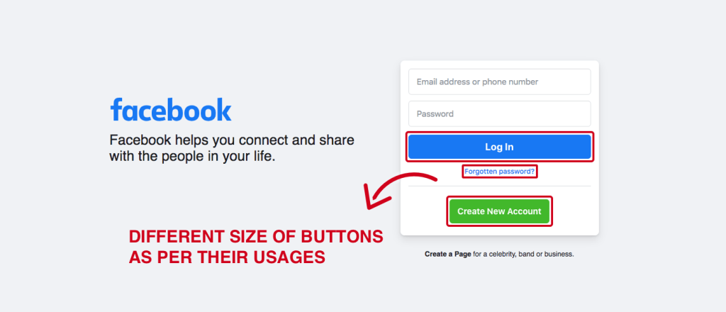
Fitts Law states that the time required to move to a target is a function of target distance and target size. This theory was originally related to the human motor system, it’s now a central principle of UX (user experience) design.
A bigger, closer target is easier to reach and should be applied to frequently used elements. However, a smaller, further target is less easy to reach and should therefore be reserved for less frequently used elements.
A simple application of this principle in web design is making small buttons a bit larger to increase visibility and click-through rate but for a button that is already in optimum size, increasing its size doesn’t produce the same effect.
This means that a button’s size should be proportionate to its frequency of use. If you notice a particular button is used a lot, you may wish to increase the size slightly. Similarly, if a button is seldom used then you may want to reduce its size.

8. Rule of third
The rule of thirds is among the key website design principles that are heavily associated with the use of imagery. It is a commonly utilized principle in photography.
To apply the rule of thirds you should create nine equal portions by using three vertical and two horizontal lines. Now, to produce interesting and eye-catching images place compositionally important elements along any of these lines or their intersections.
When it comes to adding images to your site, this is a principle you should follow.

9. Consistency
Consistency isn’t boring. It’s human nature to seek consistent patterns everywhere and web design is not an exception. Consistency is key in web design. Good web designers follow consistency in their designs. Some of the fields in a website to be consistent:
- Colors
- Fonts
- Icons
- Spacing
- Buttons
- Headings
- Breadcrumbs
- Page layout
- Behavior
Consistency is among the top website design principles. Consistent elements help give your website a polished and professional feel, which boosts brand credibility. Consistency improves the user experience as it forms awareness of patterns subconsciously in users’ minds.
10. Prioritize the user experience
Prioritizing user experience is a very important website design principle. The websites which are lacking in offering an intuitive user experience, lack conversions too. It’s very important to prioritize user experience as you want them to take action on your website (whether it’s subscribing to a mailing list or buying something).
Put yourself in your audience’s shoes and ask yourself what their biggest needs, desires, and fears are, and apply them in your web design from the fonts and colors you use to your button text and website navigation.
A good user experience on a website helps viewers to take desired actions and increase the chances of conversions.
11. Grid-based layout
Grid-based layouts are useful to keep the content structured and organized. It uses evenly spaced columns and boxes to organize elements and content into neatly aligned and balanced designs. It keeps the page clean and the website looks aesthetically pleasing.
To design content-heavy websites grid-based layout is the best option. This is a powerful visual tool that creates consistency and order in your design.
Placing blocks haphazardly can create a chaotic and not good user experience. Grids ensure consistent and pleasing website design.

12. Responsive design
If you pay attention to only one website design principle, responsive design is the one! More than half of all internet traffic comes from mobile devices; they’re increasingly becoming the most popular way we consume content.
Responsive web design is more than just fitting everything into a smaller screen. It’s about designing the whole website from a mobile point of view. The menu, breadcrumbs, buttons, images, content all should look good and work perfectly on mobile devices.
Here are some ideas when it comes to making your website mobile responsive:
- Hide unnecessary elements
- Vertically page should flow better
- Ditch Text-Blocking Ads and Pop-ups
- Make Your Button Sizes Large Enough to Work on Mobile
- Use Large Font Sizes
- Include the Viewport Meta Tag
- Use standard fonts
- Keep design simple

13. Usability
Usability is about creating a user-centric design for your website. This is among the key website design principles. Users tend to spend more time on websites that are easy to navigate, content is intuitive and UI design is mobile friendly.
It is not easy to attain good usability. It depends on whether your website is available, clear, credible, learnable, and relevant to the people who use it. It requires thorough user research and an iterative approach of constant testing and refining.
Following are the key areas to consider for usability:
- Mobile Friendly
- Simple Navigation
- Accessibility of website
- Visual Hierarchy
- Use of common design elements
- Easy to read content
- Creditability
Final Thoughts
It’s important to be creative when designing your website!
Creative design is something to be celebrated, as long as those choices are based on website design principles and accomplish the goals of your business and audience.
Ensure your next website is growth orientated – Driving increased visitors and increased conversions.


